More meaningful, with a sense of both the passage of time and volatility
I’ve been frustrated with the traditional way of reporting how much has accumulated in a Defined Contribution retirement plan account. And I’d like to suggest a way in which the numbers reported can be easier for the recipient to interpret. (For example, is $83,000 in the accumulation account good news or bad news?) In addition, my suggestion targets two other features. One is a sense of the passage of time, in that there ought to be a visible trend of increase in what the accumulation does for you over the years, rather than just a one-year or one-period presentation. The other is that, since the retirement account is invested in fluctuating markets, the report ought also to reveal the impact of market volatility. Put these last two elements together, and what you’d expect to see is a series of numbers over the years that fluctuate but reveal a trend of increasing effect. I think that would be both educational and calming for the recipient.
Let me illustrate what I’m getting at, with a set of hypothetical numbers for a person I made up. The numbers themselves aren’t important; they’re a way to show what I’m getting at. OK, here goes.
***
Let’s say I’m a 45-year-old who has been contributing to my accumulation plan for 15 years, and my projections all assume I’ll start collecting my retirement income from age 66, 21 years from now. I’m married.
My starting pay, all those years ago, was $30,000 a year, and it has progressed gradually, increasing each year by 2% of the previous year’s pay, so in this last year (2022) I was paid $39,584.
Each year 10% of that amount is contributed to my retirement account. (It doesn’t matter how much I contribute and how much my employer contributes, it’s only the total 10% that matters.) My account has been invested in an allocation that’s 70% equities (the MSCI World Index, specifically, measured in US dollars) and 30% fixed income (US Treasury bonds, earning the return specified at stern.nyu.edu), and at the start of each year the account is rebalanced back to that 70/30 allocation.
So, early this year I received my standard report on the status of my account. Here’s essentially what it said:
Account value at the start of 2022: $ 97,491
Contributions during 2022: $ 3,958
Investment earnings during 2022: ($ 17,666)
Account value at the end of 2022: $ 83,783
Explaining the negative investment earnings, it said that my account’s annualized rate of return for 2022 had been (-)17.76%.
And that was it.
Well! To start with, this was not good news!
My account had been growing steadily in the past, with negative returns only in the first year (the horrible 2008 – but there was hardly any money in the account, in that first year, so who cared?) and in 2018; and I had hoped that I would, for the first time, have gone over $100,000. If this turned out to be the case, I was planning to raise a celebratory glass to myself at dinner on the day my report arrived – ha ha, as it turned out. I’m now way, way behind where I was even at the end of 2021. All kinds of horrible thoughts went through my mind.
Have I been taking too much risk, using the investment glide path that my company uses? I mean, losing $17,666 is a huge part of my annual pay, for heaven’s sake! I can’t afford it! I’ve not only deprived myself and my spouse of the annual 10% contribution, but I’ve lost a further 45% of my year’s pay in my retirement account – and that’s gross pay, before income tax has been deducted! How can I ever make it up? Should I increase my contribution rate? But gosh, that would affect our standard of living, and with inflation the way it is, that would be a big blow.
Just bad, bad, bad news.
I remember my dad telling me he was in a defined benefit plan. It had a very simple formula for the amount of annual income he would receive, on retirement, for as long as he lived. It was, as I recall, 2% of his final pay for each year of service. So, after 15 years of service, he’d have accrued a benefit of 15 times 2%, that is, 30% of his pay. In my circumstances, this would mean an annual pension of 30% of $39,584, or $11,875 a year. That wouldn’t nearly replace the working paycheck, but the steady progress would be apparent, and he’d know that, by age 66, he would be able to replace 72% of his annual paycheck. With his mortgage out of the way and no more kids’ education to pay for, plus getting the country’s “universal” pension, that would actually give him a pretty comfortable standard of living (because his standard of living was far below what his paycheck implied, given the large amounts that the mortgage and the kids needed). And his annual pension report certainly wouldn’t produce the feeling of panic that my spouse and I felt when my latest report arrived.
***
That’s how I was thinking. And I wondered why my accumulation report didn’t tell me what proportion of my paycheck might be reproduced after I retire. I know, I know, it’s uncertain – but at least give me an estimate, even if it’s accompanied by all the legal jargon necessary to emphasize that it’s just an estimate and by no means a guarantee.
[Here’s how I did the projections. Non-techies can skip this paragraph. For the techies among you, it’s pretty much the way actuaries estimate the funded status of defined benefit pension plans (and what I describe, in much of my writing, as the way I calculate my Personal Funded Ratio). In this case, for longevity estimates, I found that the life expectancies for the participant and spouse from the participant’s age 66 are 20 and 25 years, so I calculated 20 and 25 year annuities at the current interest rate, as reflected by the 10-year US Treasury yield, and I added together 50% of each of those annuity values to reflect an annuity of 100% payable while both are alive and decreasing to 50% on the first death. Then I discounted that “joint and 50% survivor” annuity value to the present date, again using the 10-year US Treasury yield. In other words, assume that current market conditions stay unchanged, and don’t add in any expected reward for the risk of investing in equities.]
How much of my current annual pay of $39,584 would be replaced for life, from my age 66, by my current accumulated value of $83,783, if it rolls up with only the current rate of interest being earned on it? Answer: $12,369 a year, or 31% of my current annual pay (rounded to the nearest 1%).
Gosh, suddenly this doesn’t sound nearly so bad. Remember that my father’s plan, which I envied, would at this stage have reported 30% of his current pay being replaced after his retirement: almost exactly the same as my 31%. Coincidence or not, suddenly this would have calmed me down: I’m in almost exactly the same position he would have been in.
Plus, I now have placed a value I understand on my $83,783 accumulation. Relative to the value a year earlier, this represents a huge loss. But relative to the value of our home, $83,783 isn’t a whole lot of money. However, relative to my bank checking account, yes it really is a big amount. The point is, though, that I don’t know which is the best comparison, so I don’t know if $83,783 is a lot or a little. But once you express it in terms of what it’s meant to do (replace some portion of my paycheck, when that paycheck stops on my retirement – that’s why I’m saving for retirement!), now I do indeed have a good yardstick for comparison.
And I also have another basis for comparison. Relative to my dad’s plan, which was considered to be pretty much the gold standard, my 31% replacement ratio is right on target.
OK, that’s a lot better than just giving me the accumulated value and the (negative) dollar amount of the investment return for the one year just completed.
But what would make the difference between my accumulation plan and my dad’s defined benefit plan even clearer would be to show me what that 31% replacement number would have been in the past. What I know is that, in my dad’s case, it would have been a uniform progression (28% a year earlier, after 14 years of service; 26% the year before; 24% the year before that; and so on). But in my case, with equity markets volatile and interest rates volatile, I’d expect that annual sequence to also be volatile, though surely it ought to show a gradual upward trend as more and more money is contributed to my accumulation account each year.
Here’s what the sequence of replacement ratios looks like.
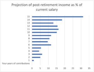
While you can’t see the actual numbers on that bar chart (just the bars themselves), here’s what they are each year, rounded to the nearest 1% in each case (and for convenience I’m grouping them in 3-year chunks, i.e., years 1-3, then years 4-6, and so on until years 13-15):
1%, 5%, 6% [i.e., Year 1 is approximately 1%, Year 2 is approximately 5%, Year 3 is approximately 6%]
4%, 5%, 12%
10%, 11%, 12%
15%, 16%, 16%
13%, 18%, 31%
There it is, the latest 31% estimate at the end of 15 years of contributions, as well as the 14 preceding estimates.
Sure enough, two things are there, if you look for them. First, in general, the trend is increasing – though you need to look at the whole sequence to detect the increases; it’s very far from steady, and the numbers jump around a lot. That’s because, second, my goodness, there’s a lot of volatility over the years (which is why I envied my dad having his predictable defined benefit plan.)
***
Two overall observations.
First, I think this bar chart and its interpretation would add a lot to the standard set of numbers shown at the start of this blog post: it would bring a sense of calmness and perspective, plus the metric of what the accumulated assets might sustain as post-retirement income on a scale (current annual pay) that’s more understandable than just a lump sum dollar value.
Second … Wait a minute, surely there’s some mistake here? I know 2022 was a rotten year for markets – confirmed by the fact that my account lost $17,666 in its value during the year. So, how come the replacement ratio WENT UP massively in 2022 from 18% at the start of the year to 31% at the end of the year? That’s great news, isn’t it?
Tell me – how is that possible when both equities and bonds plunged in value?
For the answer, tune in to the next blog post, in two weeks.
***
Takeaway
Instead of just reporting dollar values for the most recent period, convert the values to the proportion of current pay that the accumulation will support as post-retirement income, in order to make the accumulation meaningful. And show a sequence of those income numbers for many years, for a sense of perspective as well as volatility.
2 Comments
I have written about retirement planning before and some of that material also relates to topics or issues that are being discussed here. Where relevant I draw on material from three sources: The Retirement Plan Solution (co-authored with Bob Collie and Matt Smith, published by John Wiley & Sons, Inc., 2009), my foreword to Someday Rich (by Timothy Noonan and Matt Smith, also published by Wiley, 2012), and my occasional column The Art of Investment in the FT Money supplement of The Financial Times, published in the UK. I am grateful to the other authors and to The Financial Times for permission to use the material here.
Thank you for a most interesting article.
Len
Thanks, Len. I always enjoy the articles you send me, too.